As a car dealer, you need to know where your leads are coming from, which lead providers are providing you with the most sales, and which ones are providing you with the greatest Return on Investment (ROI).
By understanding where your leads are coming from, you can make more informed decisions on where you need to be putting your marketing dollars.
The new Lead Analytics Dashboard provides you with the data you need to start keeping better track of the performance of your lead providers.
Entering your dealership's monthly lead spend
Selly allows you to enter your individual lead source costs on a month-by-month basis. This gives you the flexibility to add/remove/update the different lead costs for each month individually, therefore providing you more accurate lead analytics for a given month.
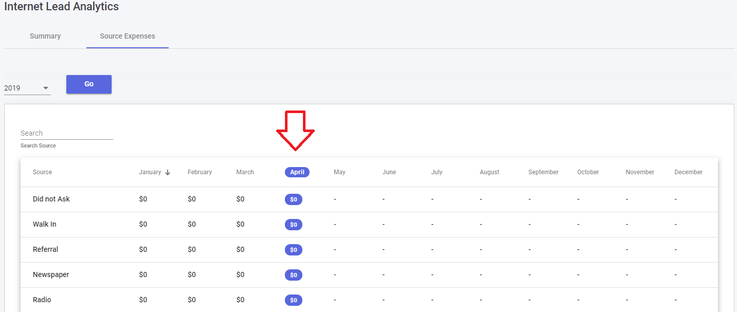
In order to update your lead expenses for a given month, navigate to the Analytics module on the web application, and make sure that you are on the to the Lead Analytics view. Now click on the Source Expenses tab.
From there, you'll see a table with a list of your various lead sources, along with columns for each month in the given calendar year.
To add/update the lead expense for a given Lead Provider and month, simply click on the cost, and enter the cost for that month.
Note that you won't be able to add/update the lead expenses for future months. Instead, Selly will automatically add the lead expenses for the next month based on the lead provider costs for the current month.
Selly takes care of this so that you don't have to worry about manually entering your lead expenses for each month.
Now that your lead expenses have been correctly entered, you'll be able to navigate to the Summary tab, where you'll see your Lead Analytics dashboard.
This dashboard contains a few key pieces:
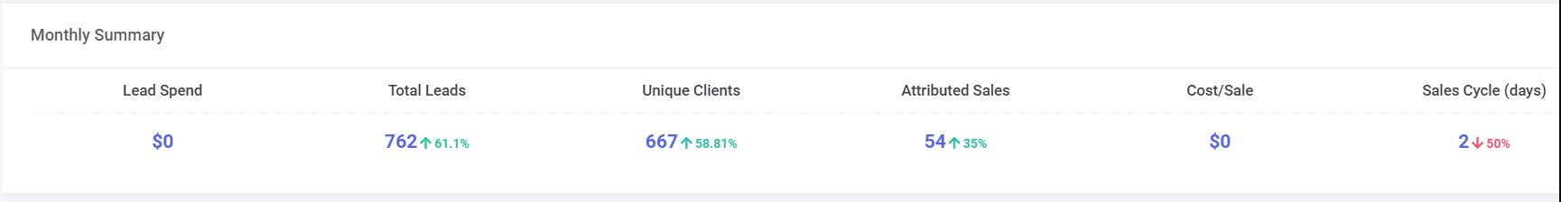
Monthly Summary
The Monthly Summary shows you the overall data for the given month. It shows the following data:
- Lead Spend (The total cost of your lead providers for the given month)
- Total Leads (The number of unique Internet Leads that were submitted for the given month)
- Unique Clients (see "Unique Clients" below)
- Attributed Sales (see "Attributed Sales" below)
- Average Cost per Sale (The total Lead Spend for the month, divided by the Attributed Sales)
- Sales Cycle (The number of days, on average, until a customer purchased a vehicle)
One thing to also notice are the percentage symbols next to each data point.
This shows the % of increase or decrease from the previous month.
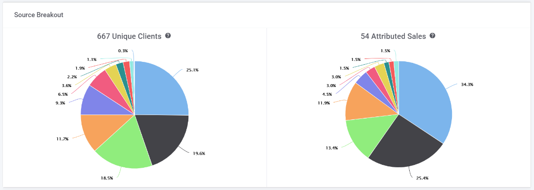
Pie Charts for Total Unique Clients and Attributed Sales
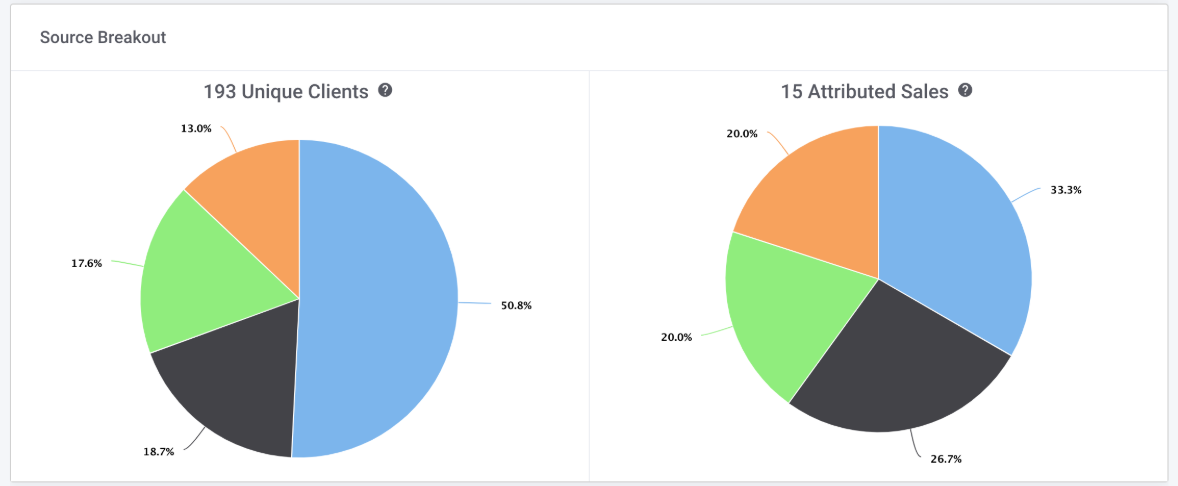
*These charts show you where your Clients/Leads are coming from, along with where your Sales are coming from.
Let's learn a little more about how to properly read and utilize these two pie charts:
Unique Clients
Unique Clients show you where your clients and Internet leads are coming from in a given month. Basically, a Unique Client is any client that has either submitted an Internet Lead in the given month or was added manually by a Selly salesperson in the given month. A single Unique Client may have submitted multiple Internet Leads from multiple Lead providers, but still only counts as a single Unique Client.
Attributed Sales
Attributed Sales might be a bit confusing at first glance, but here's an easy way to understand it better: The Attributed Sales pie chart shows you which of your lead providers are leading to the most sales.
Think of it this way, if 10 Internet leads were submitted from Cars.com in January,
how many sales did those 10 leads lead to? Selly will attribute a sale to a lead provider as long as a vehicle was purchased by the lead within 60 days.
What if a customer submitted leads from multiple different lead providers (ie. Cars.com and TrueCar)? In this case, as long as the sale was made within 60 days of submitting a lead from the particular lead provider, we attribute the sale to each of the Lead
Sources.
It's important also to note that your Attributed Sales may not correspond to the total number of sales for the given month. Instead, "Attributed Sales" are Sold deals that can be properly attributed to the Unique Clients that either submitted an Internet Lead or were created manually
during the given month.
Historical Attributed Sales Graph
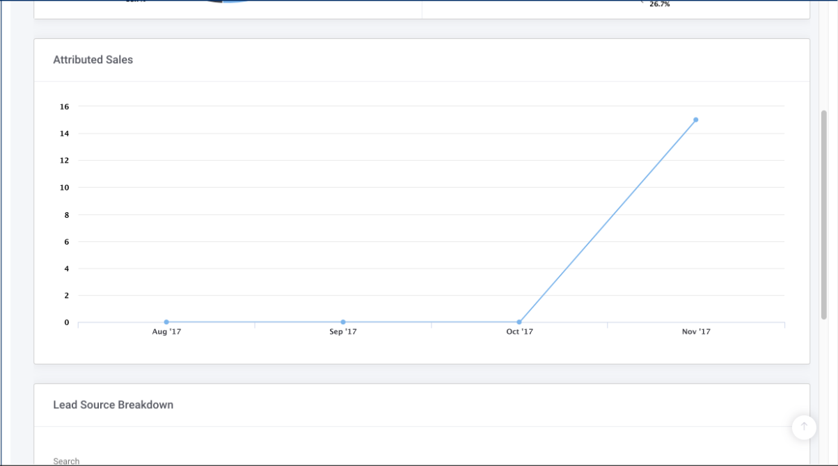
This is a straightforward graph allows you to compare your attributed sales for a given month against the attributed sales for the previous three months.
Lead Source Breakdown
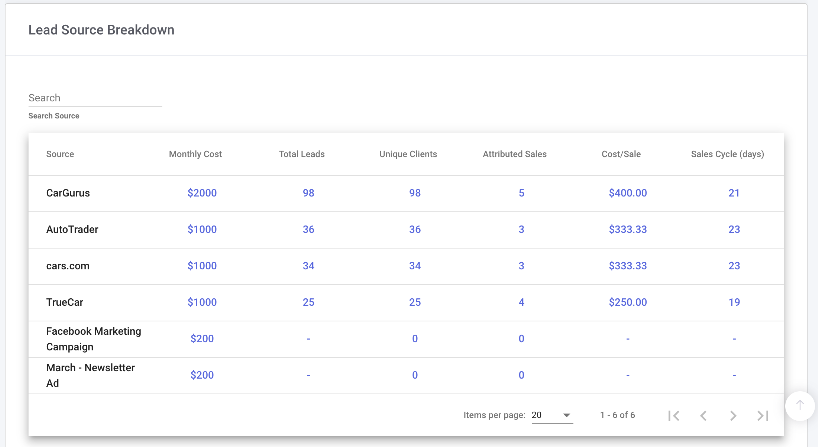
Using the table above, you can compare the performance of each of your lead sources based on the different performance indicators (Monthly Cost, Total Leads, Attributed Sales, etc.).
You can also sort the lead sources by any performance indicator you want. If you want to see which lead source provided you with the most leads, simply click on the "Total Leads" column header, and your lead sources will be ordered from most leads to least leads over the given month.
0 Comments